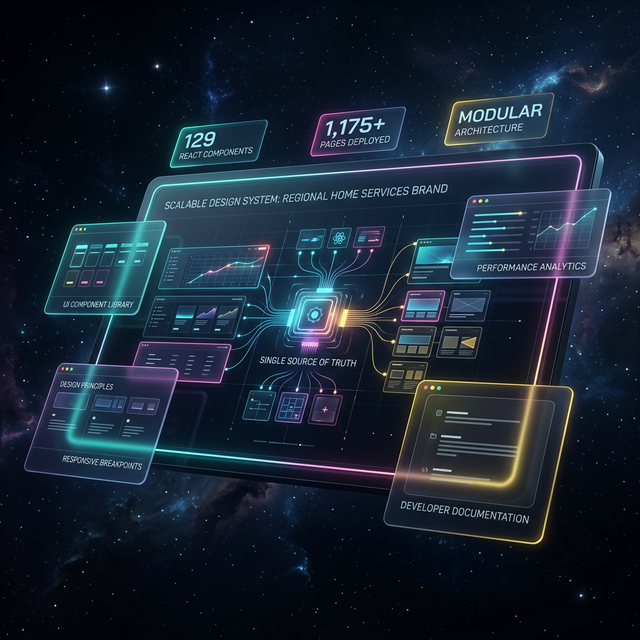
Scalable Website Design: How a Regional Home Services Brand Built 129 Components Across 1,175+ Pages
129
React Components
1,175+
Total Pages
TL;DR
A regional home services brand started with 15 pages and no consistent design language. By building a 129-component React design system on a CSS variables foundation, they scaled to 1,175+ pages — including 1,122 programmatic pages and 66 location pages — while maintaining 95+ Lighthouse performance scores and sub-200ms component render times across every page.
The Challenge: Brand Drift at Scale
A regional home services brand operating across a midwest metro and surrounding service area had grown its digital presence page by page — but without a unified design language. The result was brand drift: inconsistent colors, mismatched typography, and UI elements that were rebuilt manually for every new page. With only 15 original pages, the cracks were manageable. But the business needed to scale to hundreds of location-specific and service-specific pages to compete for local search traffic. At that volume, manual, per-page styling wasn't just slow — it was a structural liability.
Every new product page required a developer to style it from the ground up, referencing whatever styles existed elsewhere on the site. There was no single source of truth for what a button should look like, how a hero section should behave on mobile, or which font weight was correct for a section heading. Brand standards lived in someone's memory or a PDF style guide that wasn't connected to the codebase in any functional way. The business consequence was real: an inconsistent site appearance eroded user trust, slowed time-to-market for new service offerings, and made maintenance a recurring burden.
Original Pages Before System
Total Pages After System
Content Growth Achieved
Reusable React Components Built
Key Metrics: What a Scalable Web Design System Delivers
React Components in Library
Programmatic Pages Generated
Location Pages Live
Lighthouse Performance Score
Component Render Time
Full Site Build Time (Under)
Dedicated GEO Components
Phone Conversion Value Tracked
Our Approach: Design Tokens First, Components Second
The strategic decision that made this design system scalable was establishing the design token layer before writing a single component. Rather than hardcoding colors and typography into individual UI elements, the team defined all brand values as CSS custom properties at the root level. Every color — from the primary deep navy to the conversion-focused CTA orange — became a named variable. This meant that any component referencing `--cta` would automatically reflect brand color decisions, now and in the future, without requiring component-level edits.
With the token foundation in place, the team used shadcn/ui as the base component layer. This avoided weeks of building accessible, tested form elements, modals, and navigation patterns from scratch. The 67 shadcn/ui components were customized to consume the brand's CSS variables — meaning they looked and behaved like the brand from day one, while remaining fully accessible and well-tested. On top of this foundation, 62 custom business components were built for domain-specific needs: product detail sections, trust indicators, consultation CTAs, and the 5 GEO components required for location page templates.
Inconsistent Brand Across Pages
The Challenge
Colors and typography varied page-to-page with no enforcement mechanism, causing unprofessional appearance and eroding user trust.
Our Solution
CSS custom properties defined at root level, consumed by all 129 components — a single variable update propagates brand-wide instantly.
- +100% brand consistency across all 1,175+ pages
- +Global style updates in minutes, not hours
- +No per-page manual review required
Slow Page Development Velocity
The Challenge
Each new product or location page required manual styling from scratch, creating development bottlenecks and delaying time-to-market.
Our Solution
Reusable component library with documented exports — new pages assembled from existing components rather than built fresh.
- +Full site builds complete in under 60 seconds
- +1,122 programmatic pages generated without manual styling
- +Location page coverage grew 2,100%
No Conversion Tracking Consistency
The Challenge
CTA buttons were styled differently across pages and conversion events weren't reliably tracked, creating gaps in performance data.
Our Solution
A standardized ConsultationCTA component with built-in GTM tracking fires consistently on every page, with phone calls valued at $150 per conversion.
- +Consistent $150 phone conversion value tracking
- +CTA styling enforced via custom 'cta' button variant
- +Conversion events fire reliably across all 1,175+ pages
Implementation Deep Dive: Building the Component Library
Before & After
Total Website Pages
Before
15 pages
After
1,175+ pages
7,733% content growth
Location Coverage
Before
Minimal coverage
After
66 location pages
2,100% location coverage growth
Brand Consistency
Before
Manual per-page review, frequent drift
After
Automatic via CSS custom properties
System-enforced consistency across all 1,175+ pages
Component Render Performance
Before
No performance baseline — manually styled pages
After
<200ms component render time
95+ Lighthouse score maintained at scale
Site Build Time
Before
No automated build pipeline
After
Under 60 seconds full build
Full programmatic deployment in under 60s
Conversion Tracking Coverage
Before
Inconsistent CTA tracking across pages
After
$150 phone conversion value tracked on every CTA
100% tracking coverage via ConsultationCTA component
Phase one established the CSS variables design system — the non-negotiable foundation that everything else would inherit from. Using HSL-formatted custom properties, the team defined the complete brand palette: background, foreground, primary navy, accent gold, CTA orange, muted tones, card surfaces, borders, and form elements. HSL values were chosen deliberately: they make future dark mode implementation straightforward, because switching themes requires only changing the lightness values rather than replacing hex codes entirely. Layout tokens — including header height at standard and large breakpoints — were also included, ensuring responsive behavior was consistent from the start.
Phase two built the component library itself, split into two distinct tracks running in parallel. The shadcn/ui integration track customized 67 proven base components — buttons, inputs, dialogs, tabs, accordions, toast notifications, and more — to inherit the brand token layer. Simultaneously, the custom business component track built 62 domain-specific components from scratch. The most critical of these were the product detail section components: ProductHero, TrustBar, StyleOptionsGrid, TestimonialSection, ComparisonTable, FeaturesBenefits, ProductGallery, InstallationGallery, FAQSection, and RelatedProducts. These ten components, used together, power the full product page template.
-Before: Manual, Per-Page Styling
- -15 pages with inconsistent visual design
- -UI elements rebuilt from scratch for each new page
- -Brand standards enforced only through manual review
- -No conversion tracking consistency across CTAs
- -Style updates required touching every page individually
- -Development velocity limited by styling overhead
+After: Component-Driven Scalable Website Design
- +1,175+ pages with enforced brand consistency
- +New pages assembled from 129 reusable components
- +CSS custom properties enforce brand standards automatically
- +$150 phone conversion value tracked on every CTA
- +Global style updates via single CSS variable change
- +Full site builds complete in under 60 seconds
Technical Architecture: How 129 Components Power 1,175+ Pages
The component architecture follows a three-tier model. At the base layer, shadcn/ui components provide accessible, tested primitives: forms, overlays, feedback elements, and navigation patterns. These components are customized via CSS variables and class-variance-authority (CVA) variant definitions — the Button component, for example, exposes variants for default, outline, ghost, link, and a custom `cta` variant specifically engineered for conversion actions. The CVA variant system means all size and style combinations are defined in one place, preventing the kind of one-off styling that previously caused brand drift.
Above the base layer sit the business components — 62 custom-built components for domain-specific use cases. The TrustBar component renders star ratings, warranty information, licensing credentials, and fulfillment timelines in a consistent grid, pulling from a centralized business constants file rather than hardcoding values. The ConsultationCTA component wraps the Button component, adds Google Tag Manager tracking via a dedicated tracking utility, and fires a modal open event — ensuring that every call-to-action across all 1,175+ pages behaves identically and is measured against the same $150 phone conversion value. Above the business layer, the 5 GEO components power the programmatic location page templates.
Total React Components
GEO-Specific Location Components
Live Location Pages
Programmatic Pages Generated
Component Render Time
Lighthouse Score Maintained
Programmatic Scaling: From 15 Pages to 1,175+
The design system's most consequential application was enabling programmatic page generation at scale. Starting from just 15 original pages, the component library became the rendering engine for 1,122 programmatic pages and 66 location pages — a 7,733% increase in total content. Location coverage grew 2,100%, meaning the brand's addressable search footprint expanded dramatically without requiring designers or developers to touch individual pages. Every programmatic page inherits the full component system: consistent hero sections, trust bars, FAQ accordions, comparison tables, and GEO-specific content blocks, all rendering at under 200ms per component.
The 5 GEO components were specifically engineered for the location page template. A TLDR section gives search engines and users an immediate summary of the service offering in the given area. A question-and-answer section addresses location-specific queries. A benefits table surfaces competitive differentiators. A local expertise block establishes geographic authority. A comparison table allows service and product comparisons relevant to the local market. Each of these components accepts dynamic data props — location name, service specifics, local context — while rendering within the design system's constraints. The result is a page that feels handcrafted but is generated automatically, maintaining 95+ Lighthouse scores throughout.
Results & Impact: Verified Metrics
Implementation Timeline
Phase 1: Design Token Foundation
Week 1Established CSS custom properties for all brand values — color palette (primary navy, accent gold, CTA orange, muted tones), typography scale with serif/sans font variables, spacing tokens, border radius, and layout variables including responsive header height. HSL format was chosen to enable future dark mode support without variable renaming.
Phase 2: shadcn/ui Base Component Integration
Week 1–2Customized 67 shadcn/ui base components — forms, overlays, feedback elements, navigation, and data display — to consume the brand token layer via CSS custom properties. Applied the class-variance-authority (CVA) variant system to create a custom 'cta' button variant for conversion-focused actions.
Phase 3: Custom Business Components
Week 2–3Built 62 custom business components for domain-specific use cases: 10 product detail section components (ProductHero, TrustBar, StyleOptionsGrid, etc.), 5 GEO location components, multi-step consultation form components, conversion CTA with GTM tracking, banners, and layout components.
Phase 4: Programmatic Page Templates
Week 3Composed the product detail page template (13 sections from the business component library) and the location page template (5 GEO components with dynamic data props). Validated 95+ Lighthouse scores and under 200ms component render times across generated page types.
Phase 5: Scale & Programmatic Generation
Ongoing Post-LaunchDeployed programmatic generation across 1,122 pages and 66 location pages, growing total content from 15 original pages to 1,175+ — a 7,733% increase. Location coverage grew 2,100%. Full site builds validated at under 60 seconds.
Total Content Growth (15 → 1,175+ pages)
Location Coverage Growth
Programmatic Pages Live
Location Pages Live
Lighthouse Performance Score
Component Render Time
Full Build Completion Time (Under)
Tracked Phone Conversion Value
“We went from a handful of pages that didn't even look like they belonged to the same company, to over a thousand pages that all feel cohesive and professional. When we need to update the brand, it happens everywhere at once. The system just works — and it keeps working as we grow.”
— Operations Director, Regional Home Services Brand, Midwest
Key Takeaways: What Makes a Design System Scale
*Key Takeaways
- 1CSS custom properties (design tokens) are the non-negotiable foundation — all 129 components inherit brand values from root-level variables, enabling global updates without touching individual components.
- 2Starting with shadcn/ui as the base layer saved weeks of development on accessible primitives, allowing the team to focus custom effort on the 62 business-specific components that differentiate the brand.
- 3Programmatic page generation only works at scale when the component system is reliable — the 1,122 programmatic pages were only feasible because the design system guaranteed consistent rendering at under 200ms per component.
- 4Five dedicated GEO components were sufficient to template all 66 location pages, proving that a small, well-designed set of location-specific components can power significant geographic coverage growth (2,100%).
- 5Semantic naming conventions — `--cta` instead of `--orange`, `--primary` instead of `--navy` — ensure the design system remains maintainable as the brand evolves, without renaming variables across the entire codebase.
- 6Conversion tracking built directly into the design system (the ConsultationCTA component) ensures that every CTA across all 1,175+ pages fires the same tracking event with the same $150 phone conversion value — eliminating measurement gaps.
- 7Full site builds completing in under 60 seconds means the team can deploy updates confidently, knowing that changes to design tokens or component logic will propagate and verify quickly.
Brand Consistency at Scale: The Systematic Approach
Brand consistency at scale is not a design problem — it's an architecture problem. The visual identity of a home services brand is defined by its color palette, typography, spacing rhythm, and interaction patterns. When those elements live in a designer's head or a disconnected style guide, consistency degrades proportionally with the number of pages. When they live in CSS custom properties consumed by a shared component library, consistency is enforced automatically. The 129 components in this system don't just look consistent — they're structurally incapable of drifting from the brand, because every visual decision is resolved by the same token layer.
The CVA variant system for the Button component exemplifies this principle. Rather than having developers choose colors and sizes ad hoc, the component exposes a fixed set of variants — default, outline, ghost, link, and cta. The `cta` variant is purpose-built for conversion actions, applying the conversion orange token, removing border radius for a squared look, and setting hover state behavior. This means that across all 1,175+ pages, every conversion button looks identical, behaves identically, and tracks identically against the $150 phone conversion value. That level of consistency is impossible to achieve manually at this page count — it requires the system to enforce it.
Lessons Learned: What We'd Repeat and What We'd Do Differently
The decision to build on shadcn/ui rather than raw Tailwind was validated completely. The 67 base components arrived accessible, keyboard-navigable, and ARIA-compliant — removing a class of quality concerns that would have consumed significant development time. If we were starting over, the one addition we'd make from day one is Storybook for component documentation. As the library grew to 129 components, developer discovery relied on well-organized `index.ts` export files — functional, but a visual component explorer would have accelerated onboarding and made the library more self-documenting.
The incremental component development approach — building components as actual page templates required them, rather than speculatively — proved correct for a project at this scale and timeline. Over-engineering the library upfront would have delayed page production without adding measurable value. The animation utility system (shared `fade-in-up` keyframes with configurable stagger delays) was a small investment that created outsized perceived quality across the site — a pattern worth adopting early in any design system project. The HSL-based CSS variable format, while slightly less intuitive than hex codes, paid dividends by making the dark mode foundation trivially easy to scaffold for future implementation.
*Key Takeaways
- 1Use shadcn/ui as the base layer for any React design system — the accessibility and testing coverage it provides is worth far more than the customization overhead.
- 2Build components incrementally as page templates require them — speculative component development adds complexity without immediate value.
- 3HSL-formatted CSS variables are worth the minor learning curve because they make theming, dark mode, and opacity variations structurally simple.
- 4Shared animation utilities (a single keyframe definition used across all components) create visual cohesion with minimal code overhead.
- 5Design tokens should use semantic names (`--cta`, `--primary`) not descriptive ones (`--orange`, `--navy`) so the system survives brand evolution.
- 6At 1,175+ pages, conversion tracking must be a design system concern — not an afterthought — to ensure measurement consistency across every page.
Technology Stack
Frequently Asked Questions
A scalable web design system is a library of reusable UI components, design tokens, and documented patterns that allow a website to grow without visual inconsistency or developer rework. For a home services brand operating across dozens of service areas, this means every location page, product page, and landing page shares the same brand standards automatically — without manual review or per-page styling.
In this case study, 129 React components — a mix of 67 shadcn/ui base components and 62 custom business components — power all 1,175+ pages. That includes 1,122 programmatic pages, 66 location pages, and a range of landing and product pages, all drawing from the same component library.
The design system achieved 95+ Lighthouse scores across pages and component render times under 200ms. Full site builds complete in under 60 seconds, which is critical for a programmatic site at this scale.
Brand consistency is enforced through CSS custom properties (design tokens) at the root level. All components reference shared variables for color, typography, spacing, and border radius — meaning a single CSS update propagates across every component on every one of the 1,175+ pages instantly.
Five dedicated GEO components were built specifically for location pages: a TLDR section, a question-and-answer section, a benefits table, a local expertise block, and a comparison table. These components dynamically populate with location-specific data while maintaining consistent brand presentation.
The design system enabled a 7,733% increase in total content pages by making programmatic page generation fast and reliable. Starting from 15 original pages, the site grew to 1,175+ pages — with each new page rendered from the shared component library rather than built from scratch.
Phone calls are tracked as conversion events with a value of $150 per call. The ConsultationCTA component and associated tracking utilities are built directly into the design system, ensuring consistent conversion tracking fires correctly on every page that includes a call-to-action element.
Related Case Studies
Ready to achieve similar results?
Get a custom growth plan backed by AI-powered systems that deliver measurable ROI from day one.
Start Your Growth Engine